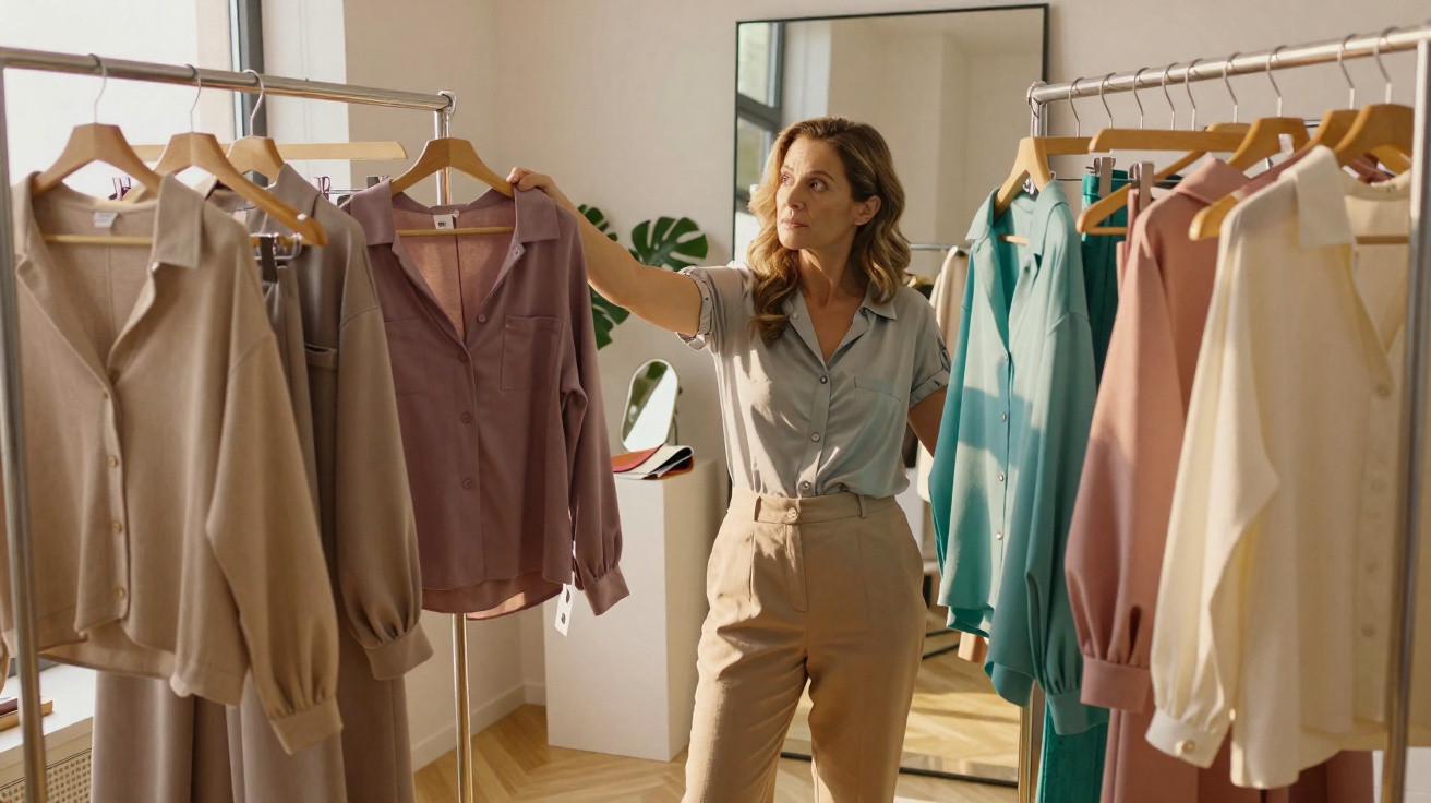
You slip into a grey jumper you have always adored.
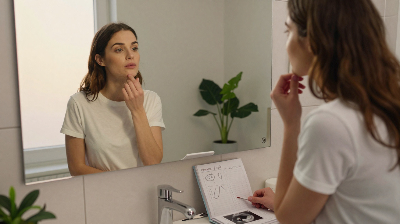
Then you glance in the mirror and something seems… wrong. It is not a dramatic change, merely a slightly duller, more weary-looking version of yourself than you recall. The creases around your mouth appear more defined, the area beneath your eyes a touch darker, and you find yourself asking when your face began to change quite so much.
The reality is that the jumper has not aged.
You have. Or, at least, that is the story your mind is telling you.
Colour plays a surprisingly subtle part in the conversation we have with our reflection each morning. Certain shades may, without us noticing, add five or ten years to the appearance of our face.
Why some colours quietly add years to our face
Psychologists have examined facial perception for decades, and one finding appears repeatedly: contrast matters.
Our minds tend to interpret youth through brightness, freshness and distinct contrast between the skin, lips, eyes and hair. If the colour we wear diminishes this natural contrast, the face may seem flatter and older.
This explains why supposedly reliable colours such as beige or muted grey are not always as safe as they seem. For some people, they softly flatter the face; for others, they appear to remove its vitality almost instantly.
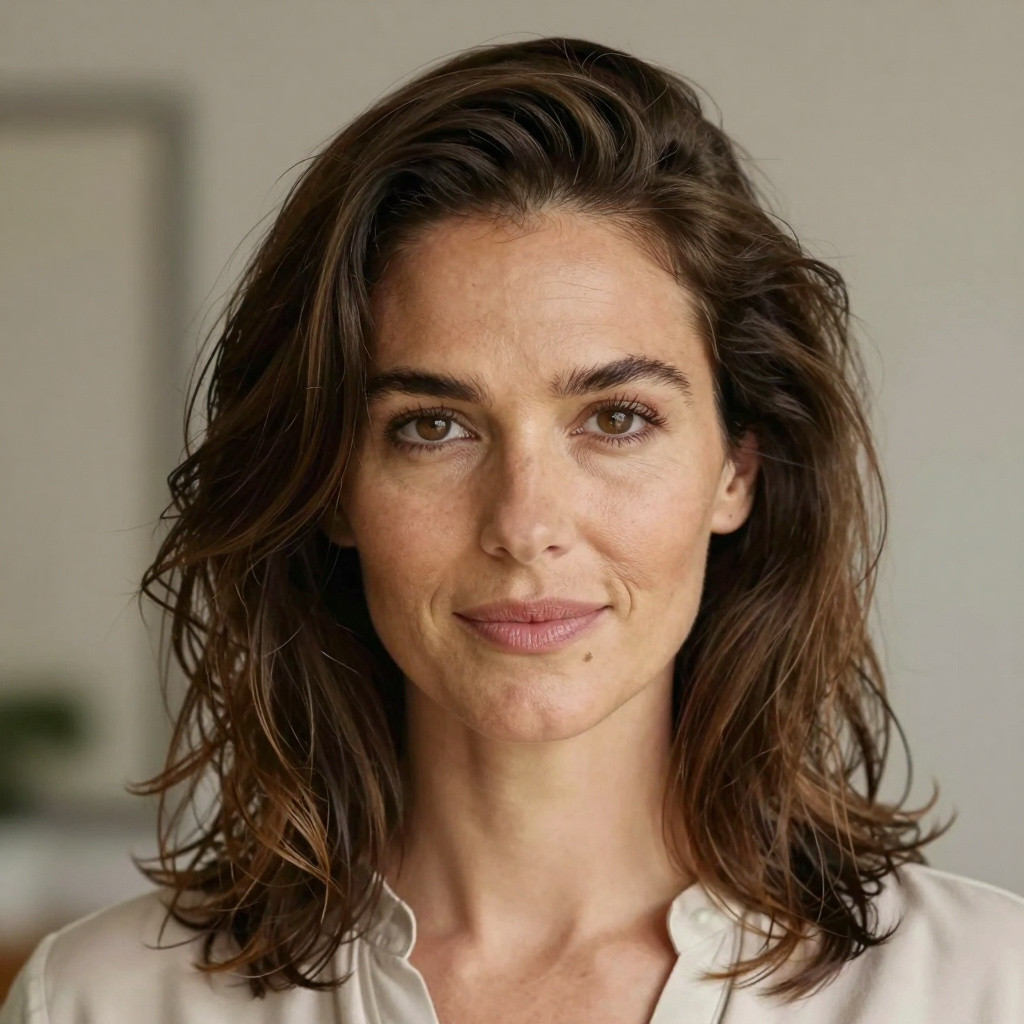
Imagine two photographs of the same woman in her late forties. In the first, she wears a faintly yellow beige blouse, close to the shade of aged paper. Her jawline seems less defined, the shadows beneath her eyes look stronger and her complexion appears uneven.
In the second image, the lighting and make-up are identical, but she is wearing a cool navy-blue top. Her eyes immediately stand out, her skin appears clearer and her fine lines seem less noticeable. Her face has not changed at all. Only the colour surrounding it has.
Experts in facial perception note that the brain makes rapid judgements about age from signals including contrast and luminosity. An unsuitable shade can influence that judgement in less than a second.
So, which colours are usually responsible?
The most common offenders either sit too close to the wearer’s skin tone or cast an unnatural hue across it. Consider muddy browns, yellow-heavy beiges and washed-out pastels that seem as though they have survived a hundred washes.
These shades can intensify sallowness, redness and shadows. They lessen the lively distinction between facial features that we tend to link with youth. When a colour is too similar to your skin, your clothes and face can merge visually into one weary-looking block.
It is little wonder that so many people arrive at meetings looking “more tired than they feel” without knowing the reason.
The surprisingly ageing shades most of us still wear
The first regular offender is dull, dusty beige.
Not every neutral is unflattering, but the slightly yellowed beige reminiscent of a rented-office wall often emphasises fatigue in lighter complexions and shadows in darker ones. It may draw attention to bluish under-eye circles and make the whites of the eyes seem less bright.
Certain greys follow closely behind. Very cool, flat greys carrying a trace of green or brown can place an almost concrete-like filter over the face. Rather than looking chic and minimalist, they can create an effect that is tired and “under the weather”.
Then there are the pastels that appear charming on a hanger yet oddly severe once worn. Pale peach, chalky lilac and powder-blue with an icy cast are examples. They may look fresh against younger skin with strong contrast. Once texture and fine lines become visible, however, those same shades can bring out unevenness and redness.
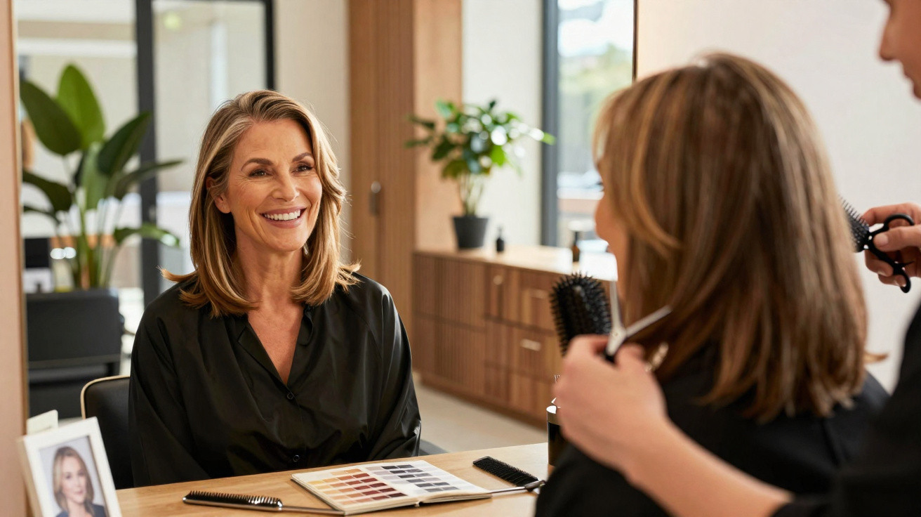
I once saw a stylist carefully replace a client’s treasured pale-peach cardigan with a warmer coral one. The woman, who was in her fifties, genuinely gasped when she looked in the mirror. “I look like I’ve slept,” she blurted out. It was the same face, but colour told an entirely different story.
From a psychological perspective, we associate warmth and clarity with vitality. Cool, murky or “dirty” shades often suggest the reverse. This is why muddy olive, tobacco brown and faded black that is almost brown-black can look ageing when they are worn near the face.
We also make unconscious assessments based on brightness. Extremely dark shades with too little reflected light near the face can compress the features and intensify every small shadow. Equally, very pale and chalky colours may wash out the face until little structure remains.
The ideal balance lies between these two extremes: shades that either softly reflect your natural colouring or provide a crisp, clear contrast. This is when the face appears alert rather than worn down.
How to choose colours that don’t age you overnight
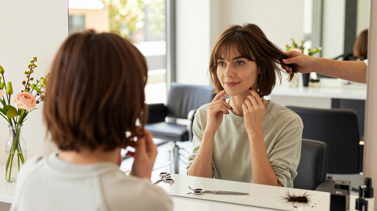
One straightforward method favoured by psychologists and stylists alike is the “mirror test”. Stand in natural daylight, sweep your hair away from your face and hold different tops or scarves directly beneath your chin.
Pay no attention to the garment itself. Instead, look at your skin, eyes and mouth.
If a colour makes your under-eye circles more obvious, your teeth appear yellower or your skin look blotchy, it is not helping you. If your eyes look brighter and your complexion seems more even, you have found a flattering option.
Most of us make the mistake of believing the hanger rather than the mirror. We become attached to a shade in a shop, on a model or on a friend, then dismiss the quiet thought asking, “Why do I look tired in this?”
Try to be gentle with yourself about this. Clothing holds memories, and parting with a favourite jumper that is now ageing can feel unexpectedly emotional. We have all experienced the moment when a much-loved item no longer suits the face we see today.
In truth, nobody carries out this exercise every day. Yet one honest colour review each season can already make a significant difference.
Colour psychologist Angela Wright once said, “Colours don’t just decorate us, they communicate for us. Sometimes they’re telling the world we’re older or more exhausted than we actually are.”
- Colours that often age the face: Dull beige, “dirty” pastels, flat yellow-based browns and washed-out greys worn near the face.
- Colours that tend to flatter with age: Clear jewel tones such as teal, emerald and raspberry, rich navy, soft off-white and well-balanced warm neutrals.
- Easy fixes without changing your whole wardrobe: Introduce a scarf or T-shirt in a flattering shade at the neckline, switch to a brighter or warmer lipstick, and keep ageing colours away from directly beneath the chin.
Learning to age with our colours, not against them
Eventually, we stop pursuing the face we had at twenty and begin dressing the face we have now. Colour can support that adjustment. It will not remove wrinkles, but it can soften the overall impression others form of us - and the impression we form of ourselves.
Rather than treating certain shades as forbidden, think of it as a quiet renegotiation. That severe black polo neck might become a skirt, while dull beige can be worn as trousers, well away from the face. You can retain the pieces you love, simply placing them in more forgiving areas.
There is pleasure, too, in realising that colours you had never previously considered can suddenly brighten you. A soft teal scarf, a warm rose shirt or a deep berry lipstick: small changes can have a major visual effect.
Psychology returns to the same message: what we wear affects how we feel and how other people interpret us. Colours that add years can be removed, or at least moved away from centre stage. The shades that restore your brightness, energy and present-day story can take their place instead.
That is the point at which age stops being something to conceal and becomes something you truly dress for.
| Key point | Detail | Value for the reader |
|---|---|---|
| Identify ageing colours | Look out for dull beiges, flat greys, muddy browns and chalky pastels worn near the face | Helps you avoid shades that emphasise tiredness and fine lines |
| Use the mirror test | Compare the effect different colours have on your skin and eyes in natural light | Provides a simple, free way to identify flattering tones immediately |
| Adjust, don’t overhaul | Move difficult colours away from the face and introduce small touches of flattering shades | Keeps style manageable without needing to replace your entire wardrobe |

Comments
No comments yet. Be the first to comment!
Leave a Comment